
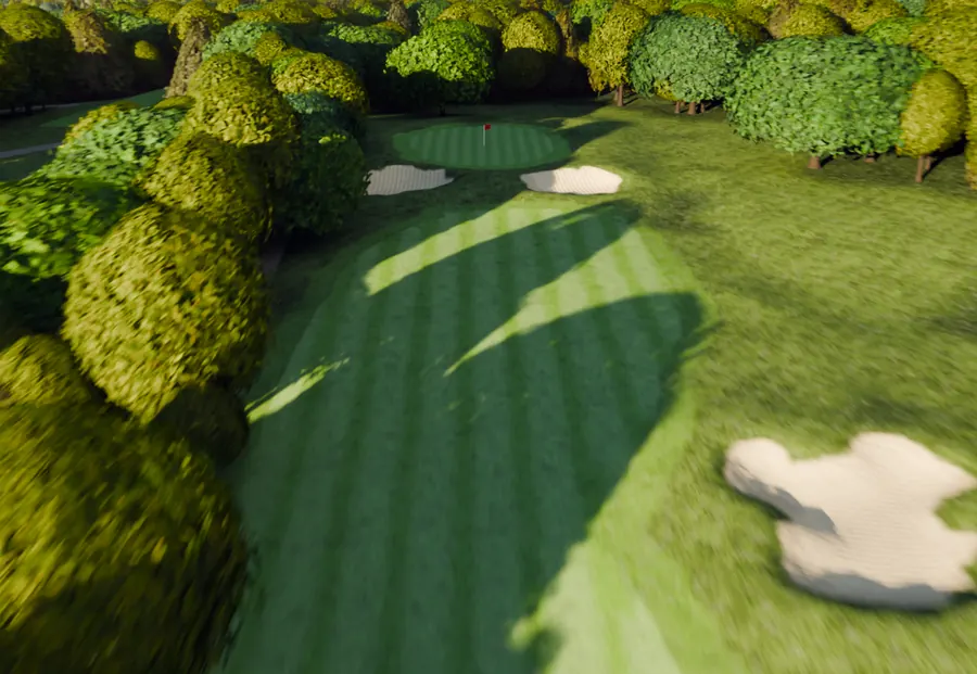
A list of eighteen holes is not how anybody thinks about a golf course. People think about it spatially: the stretch along the water, the uphill one, the short par four everyone talks about.
An interactive map lets a golfer navigate the way they already think. They see the whole property, they tap the hole they are curious about, and that hole opens. This guide covers what such a map should show, what it should refuse to be, and where on your website it belongs.
What the map is for
One job: getting somebody from "I have never seen this course" to "I have seen the hole I was curious about" in a single tap.
That sounds small. It is the whole difference between a course page people bounce off and one they spend four minutes in, because a list asks them to pick a number with nothing to pick on, and a map gives them a reason to pick.

What it should show
The property, honestly, and the holes on it. Specifically:
- All eighteen at once, so the shape of the course reads at a glance
- Hole numbers, placed so they are legible on a phone
- The real ground: fairway, bunker, water, trees, cart path
- Routing, so a golfer can see which way the course flows
That last one matters more than it sounds. A course where the front nine loops away and the back nine comes home along the river is a different experience from one that goes out and back, and a map is the only thing on your website that communicates it.
What it should not try to be
The temptation with a map is to keep adding to it until it is a planning tool. Three things to leave out:
- Distances to arbitrary points. That is a distance app's job, mid-round,
with a golfer's position. A marketing map that implies it measures is a map that will be wrong.
- Pin positions. They move daily and nobody updates a website daily.
- Every tee box as a separate layer. The complexity cost is immediate and
the benefit is for a golfer who has already chosen to come.
The map's reader is deciding whether to come. Build it for them, and let the app on their phone do the job it is already doing.
Where it belongs
On the course page, as the way into the holes, above any table of yardages.
Two other placements earn their keep, and both reuse the same embed rather than needing anything new:
- Membership, where somebody is weighing a season rather than a round
- Outings, where an organiser needs to picture a group on ground they have
never walked
One thing worth saying about the outings page specifically: an organiser is usually choosing on behalf of other people and has to defend the choice. A map and eighteen clips are something they can forward, which is a different kind of usefulness than anything else on your site provides.
Keeping it correct
A course changes. Bunkers get rebuilt, a green gets moved, trees come down in a storm.
The practical rule is that the map and the clips should be updatable per hole rather than as one indivisible thing, so a bunker renovation on the fourth costs you the fourth and not the other seventeen. Ask about that specifically of anyone building you one, because the answer determines what the second year costs.
Two related questions worth asking at the same time:
- If a hole is updated, does the link to that hole stay the same? It should, or
every tee marker code and every email you have sent points at nothing.
- If you rebuild your website, does the map move? It should, because it is an
embed and not part of your theme.
How it fits with the rest of the page
The map is the navigation. The clips are the content. The table off your card, if you keep one, is the reference a golfer reads after they have decided.
Keeping those three in that order is most of what separates a course page that works from one that is simply thorough. The tour page checklist covers the rest of that page, and adding it to your site covers the ten minutes of actually getting it live.