
The course page is the page that decides it. A prospective member, an outing organiser, or a golfer picking between two courses on a Saturday morning all end up there, and most club course pages give them a table.
This is a checklist for the version that answers their question. It is written for whoever is going to build or brief the page, and it is deliberately about structure rather than about design.
The job of the page, in one sentence
Somebody who has never seen your course should finish this page knowing how it plays. Not how it scores, not how it ranks, how it plays: where the holes turn, what the approaches look like, where the trouble is.
Everything below either serves that or does not belong.
Per hole, the things that earn their place
Five, and only the first is non-negotiable:
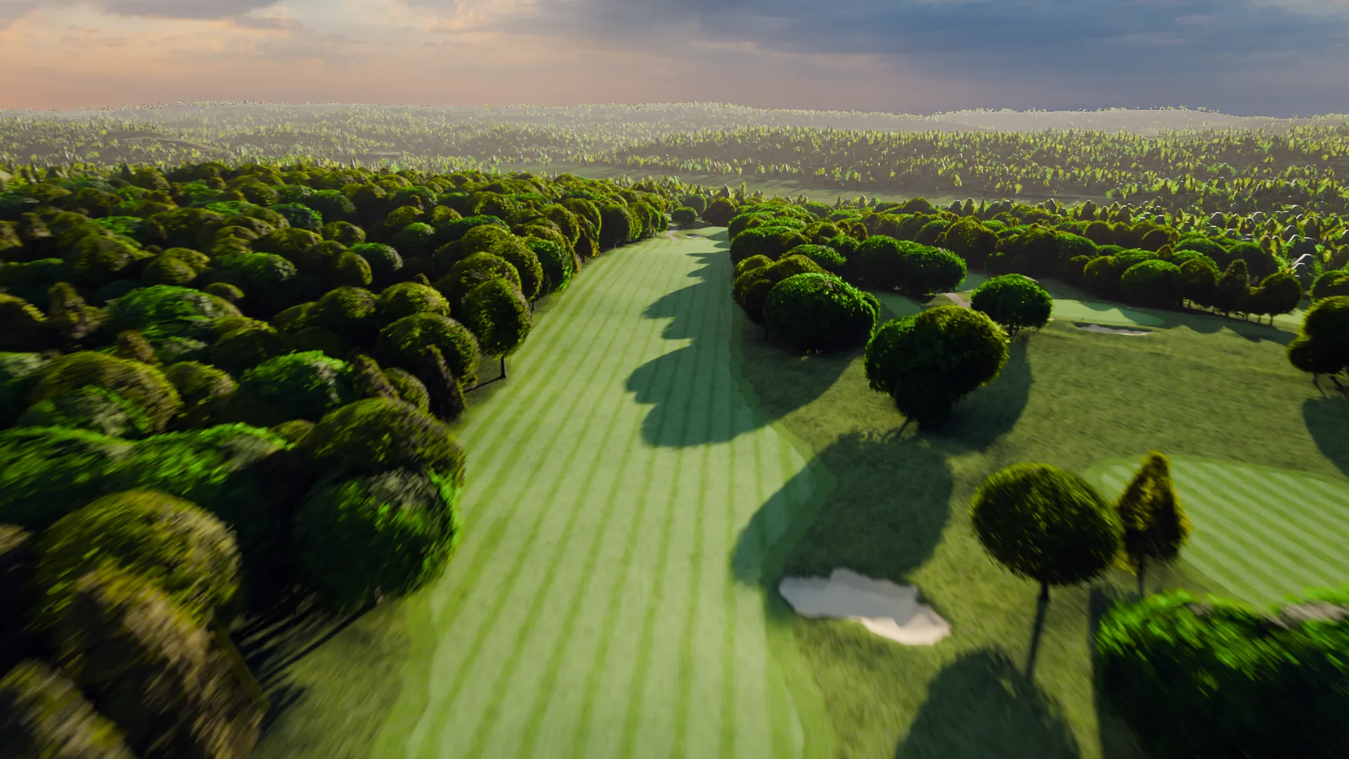
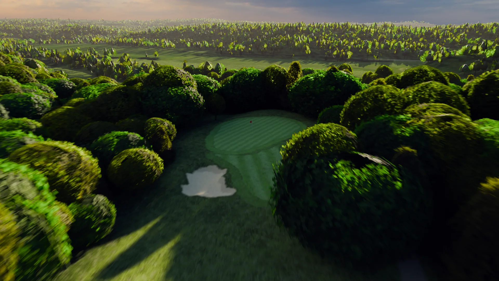
- The hole, seen from the air, tee to green. The one thing a still picture
cannot do, because a still has a single viewpoint and a hole is a journey.
- Par and the distances from your scorecard. See the warning below; these
are the numbers worth being careful about.
- A name, if the hole has one. Clubs with named holes should use them; they
are memorable and they are yours.
- One line of character, if it is true. "Water right from the tee" earns
its place. "A challenging test of accuracy" does not.
- Its own link. So a hole can be sent to someone, or opened from a code on
the tee marker.
The one number never to calculate
Distances come off your scorecard and nowhere else. Not measured off a map, not derived from an image, not estimated.
A course tour that prints a distance a golfer then disagrees with has undermined everything else on the page, and the disagreement will happen: a golfer knows the seventh is 412 and the page says 430. If the card is not to hand for a hole, the hole carries no distance at all. That reads as careful. A wrong number reads as careless about everything.
The same goes for par. It belongs to the card.
The navigation, which is where most tour pages fail
A list of eighteen links is not navigation, it is a list. A golfer thinking about your course is thinking spatially: the one along the river, the short one over the water, the long par five coming home.
A map of the course with the holes on it lets them pick that way. Tapping a hole on a map is how people actually choose which hole to look at, and a tour page with a map gets far deeper into the eighteen than one with a dropdown.
Two things the map should do:
- Show the whole course at once, so the shape of the property reads
- Open a hole in place, without a page reload that loses their spot
What to leave off
Shorter list, and each one is on here because it is common:
- Stock golf imagery. A golfer can tell. One real picture of your
fifteenth is worth every stock image ever licensed.
- Autoplaying sound. On a phone, in public, this is an immediate close.
- A PDF of the scorecard as the only hole information. Nobody opens it.
- Claims that cannot be checked. "One of the finest layouts in the state" is
a sentence a reader skips. "Eighteen holes, par 72, the card on every hole" is not.
- A form before the content. Let them see the course. The ones who want to
talk will find the contact page.
Where the page sits
Linked from the main navigation by name, as The Course or Course Tour. Not buried under About, and not reachable only from the home page carousel.
Two more placements worth having, both of which reuse the same thing rather than building anything new:
- The membership page, because a prospective member is making a bigger
decision than a round and deserves the same view
- The outings page, because an organiser is picturing a group on ground they
have never walked
How to tell if it worked
Not by a feeling about the design. Three things, all of which somebody at the club can check:
- Can a stranger get from your home page to a specific hole in two taps?
- Does the page work on a phone held in one hand, in sunlight?
- Does somebody who has never played here finish it knowing where the trouble
is?
The third is the real test and the easiest to run. Show it to somebody who has never seen the course and ask them which hole they would most want to play. If they can answer, the page works. If they say they are not sure, the page is a list with pictures.
A live example of all of this, built for one course, is on the course tour page, and the website checklist covers the pages either side of it.